RALPH PRINS
1926, Amsterdam, NL
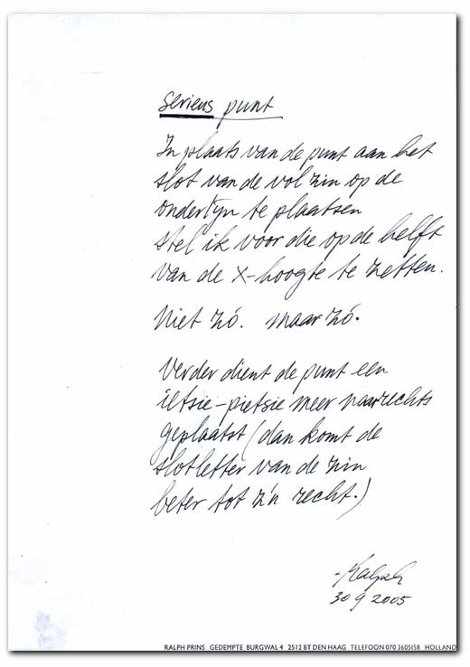
_TRANSLATION: Serious point
Instead of placing the period at the end of the sentence on the baseline, I propose to put it halfway the X-height. (demonstrated above: "niet zó. maar zó.") Furthermore the period needs to be moved a teeny-weeny bit to the right (this way, the last letter of the phrase will stand out better.)
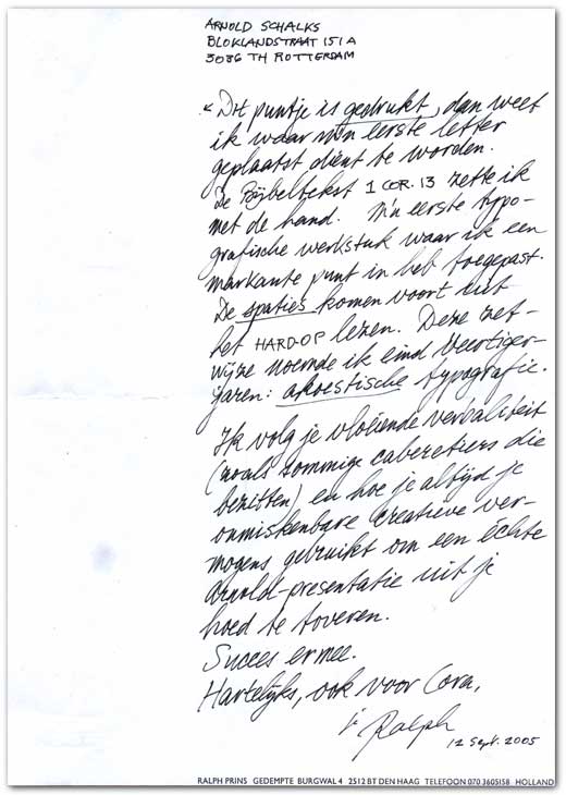
_TRANSLATION: This dot (see arrow) is printed for me to know where I can write my first letter. I typeset the scriptural passage '1 Cor. 13' by hand. My first typographic piece of work, for which I used a striking period. The spacing resulted from reading ALOUD. In 1946, I called this way of typesetting acoustic typography. [...]
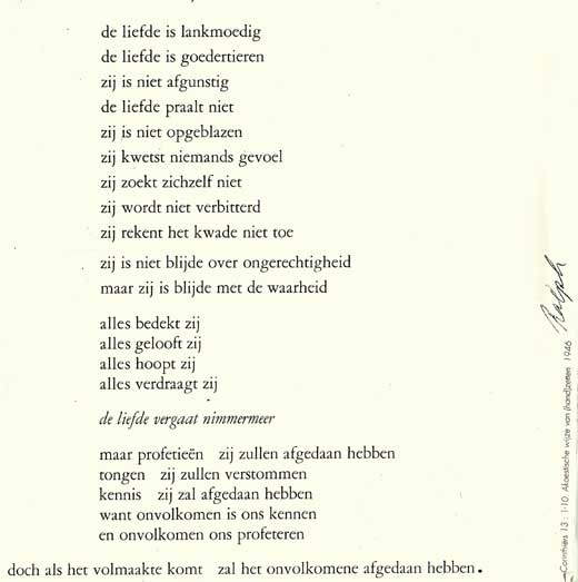
Detail van akoestische typografie (1 Cor.13: 1-10). / _Detail of acoustic typography (1 Cor.13: 1-10).
Naast de boven getoonde 'serieuze' punten stuurde Ralph Prins ook 'luchtiger' bijdragen in, die ik 'lichtpuntjes' zou willen noemen. Klik hier voor een selectie.
_On top of the 'serious' points, documented on this page, Ralph Prins send a set of more 'airy' contributions, I would like to call 'points of light'. Click here to view a selection.